

Home
Indigo Design System
From operational chaos to structured clarity: Designing a unified system for Africa’s growing property management market
Problem
An opportunity to standardize fragmented property workflows
Property managers and landlords often rely on spreadsheets, messaging apps, and manual reminders to handle tenants, payments, and maintenance issues. This results in missed deadlines, lost records, and poor tenant experiences.
We needed a modular design system that could:

Support role-based views (e.g., Tenant vs. Landlord)

Scale with features like ticketing, payments, and unit onboarding

Reduce visual noise while preserving functionality for power users
I started by working closely with the CEO (a property manager himself) and Full Stack developers, to map out real-world workflows. We focused on understanding:
Research insight
Taking stock of issues through familiar frameworks

How landlords onboard new tenants
Pain points in rent collection and tracking
How maintenance issues are reported and resolved
The communication gap between stakeholders
This research informed the Information Architecture, User Roles, and MVP Scope.
System architecture & role mapping
Aligning product architecture with real-world roles
We designed Indigo around three primary user types — each with its own visual priorities, permissions, and workflows:

Landlords/Agents — Manage properties, track income, approve tickets
Tenants — View leases, make payments, report issues
Admins — Monitor platform activity and resolve escalations
Design system creation
Building a system to drive consistency and scale
With limited engineering bandwidth, our design system had to be practical — not theoretical. I focused on clarity, reusability, and visual hierarchy across components.
Design Principles
Contextual Clarity — Every element serves the user's immediate goal
Scalable Consistency — Components adapt across device sizes and user roles
Performance Minded — Optimized for 3G networks prevalent in target markets
Accessibility First — WCAG 2.1 AA compliance from day one
Foundations
Typography — Clean sans-serif system for high readability
Spacing & Grid — 8pt grid system for visual consistency
Color — Primary, secondary, tertiary, quartenary, accent, neutral.
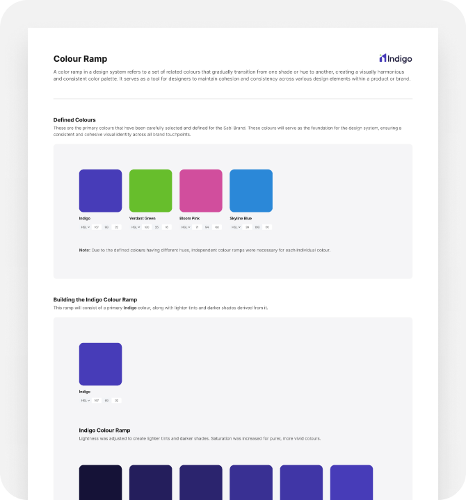
COLOR RAMP SNAPSHOT
Components
Action buttons, badges, status indicators
Text fields, forms for KYC, rent, and issue reporting
Tab systems and modals for multistep actions
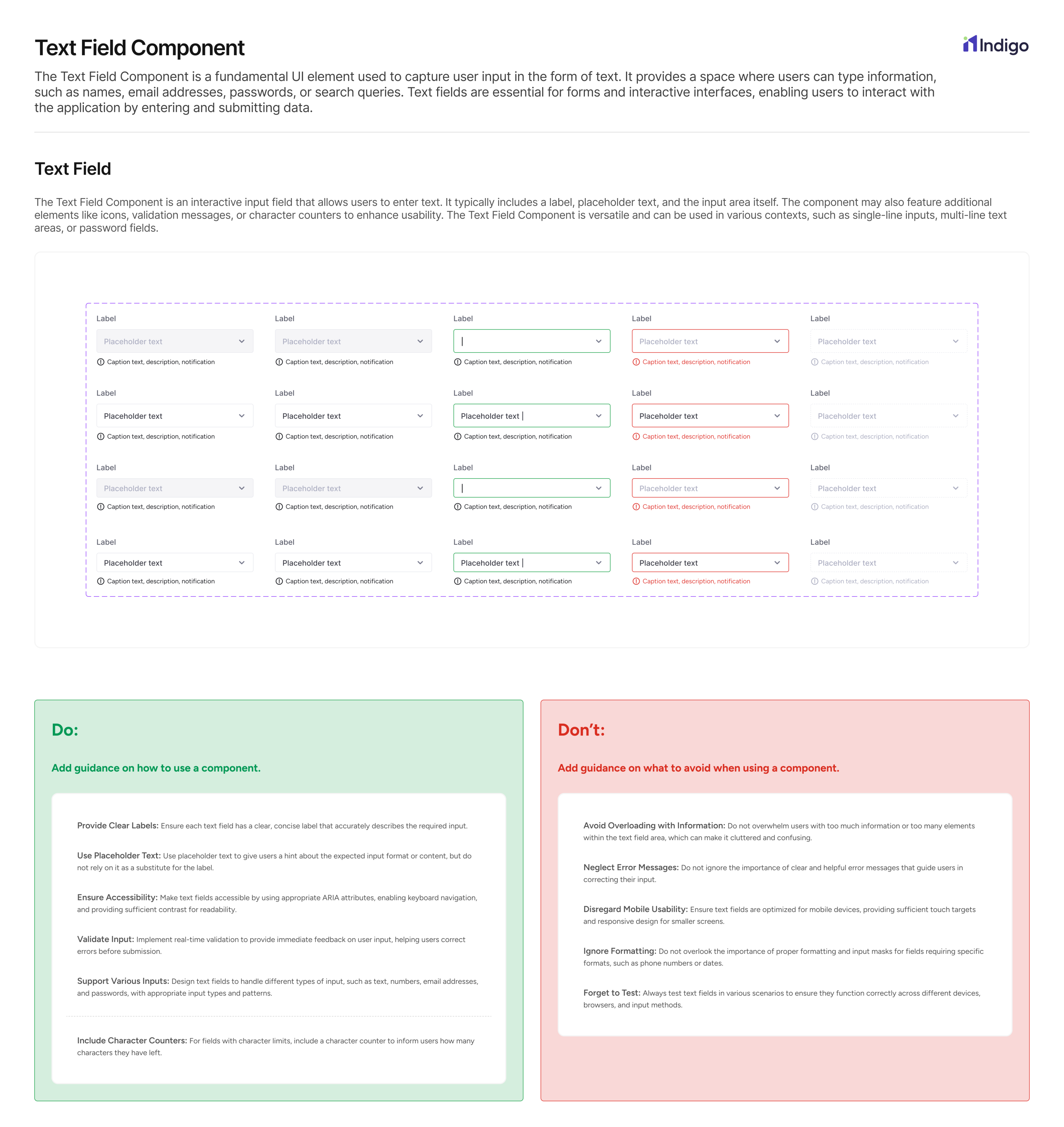
TEXT FIELD COMPONENT SNAPSHOT
Looking back
Measuring success through velocity and clarity
Outcomes
As we move past MVP, the Indigo design system is evolving to support scale while keeping clarity and usability front and center.

Systemized components led to faster development across features
Stakeholder dashboards improved visibility and reduced support tickets
Pilot testers rated the UX “clear, fast, and professional”
What’s next?
As we move past MVP, the Indigo design system is evolving to support scale while keeping clarity and usability front and center.

Smart financial insights for landlords

AI-driven rent and occupancy forecasts

Multi-channel messaging components for tenant engagement
Up Next: Jojolo Mobile App

Home
Indigo Design System
From operational chaos to structured clarity: Designing a unified system for Africa’s growing property management market
Problem
An opportunity to standardize fragmented property workflows
Property managers and landlords often rely on spreadsheets, messaging apps, and manual reminders to handle tenants, payments, and maintenance issues. This results in missed deadlines, lost records, and poor tenant experiences.
We needed a modular design system that could:
Support role-based views (e.g., Tenant vs. Landlord)
Scale with features like ticketing, payments, and unit onboarding
Reduce visual noise while preserving functionality for power users
I started by working closely with the CEO (a property manager himself) and Full Stack developers, to map out real-world workflows. We focused on understanding:
Research insight
Taking stock of issues through familiar frameworks
How landlords onboard new tenants
Pain points in rent collection and tracking
How maintenance issues are reported and resolved
The communication gap between stakeholders
This research informed the Information Architecture, User Roles, and MVP Scope.
System architecture & role mapping
Aligning product architecture with real-world roles
We designed Indigo around three primary user types — each with its own visual priorities, permissions, and workflows:
Landlords/Agents — Manage properties, track income, approve tickets
Tenants — View leases, make payments, report issues
Admins — Monitor platform activity and resolve escalations
Design system creation
Building a system to drive consistency and scale
With limited engineering bandwidth, our design system had to be practical — not theoretical. I focused on clarity, reusability, and visual hierarchy across components.
Design Principles
Contextual Clarity — Every element serves the user's immediate goal
Scalable Consistency — Components adapt across device sizes and user roles
Performance Minded — Optimized for 3G networks prevalent in target markets
Accessibility First — WCAG 2.1 AA compliance from day one
Foundations
Typography — Clean sans-serif system for high readability
Spacing & Grid — 8pt grid system for visual consistency
Color — Primary, secondary, tertiary, quartenary, accent, neutral.
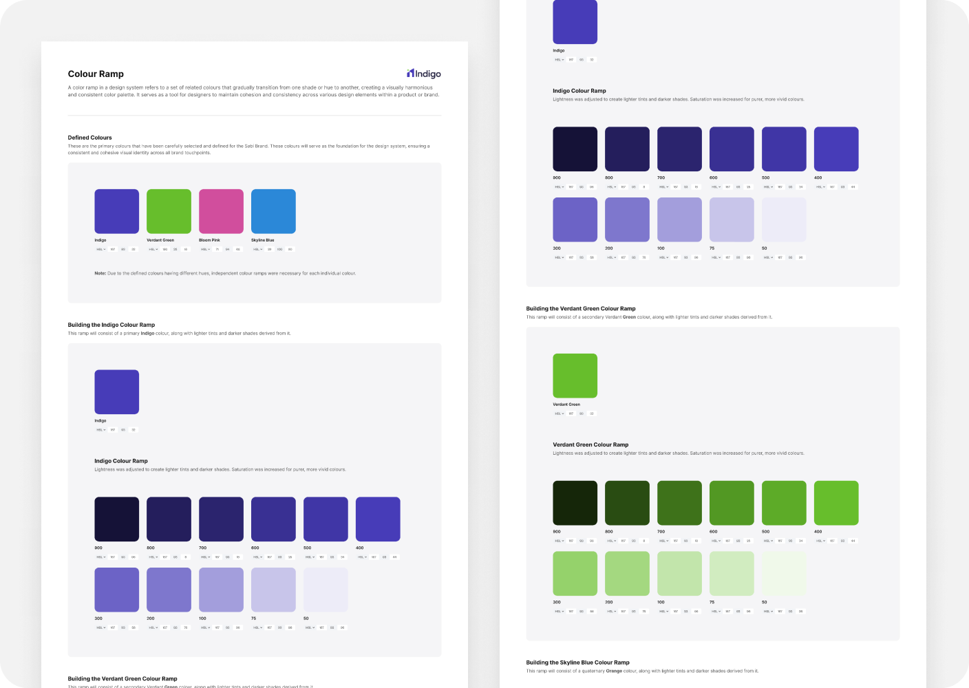
COLOR RAMP SNAPSHOT
Components
Action buttons, badges, status indicators
Text fields, forms for KYC, rent, and issue reporting
Tab systems and modals for multistep actions
TEXT FIELD COMPONENT SNAPSHOT
Looking back
Measuring success through velocity and clarity
Outcomes
As we move past MVP, the Indigo design system is evolving to support scale while keeping clarity and usability front and center.
Systemized components led to faster development across features
Stakeholder dashboards improved visibility and reduced support tickets
Pilot testers rated the UX “clear, fast, and professional”
What’s next?
As we move past MVP, the Indigo design system is evolving to support scale while keeping clarity and usability front and center.
Smart financial insights for landlords
AI-driven rent and occupancy forecasts
Multi-channel messaging components for tenant engagement
Up Next: Jojolo Mobile App
Home
Indigo Design System
From operational chaos to structured clarity: Designing a unified system for Africa’s growing property management market
Problem
An opportunity to standardize fragmented property workflows
Property managers and landlords often rely on spreadsheets, messaging apps, and manual reminders to handle tenants, payments, and maintenance issues. This results in missed deadlines, lost records, and poor tenant experiences.
We needed a modular design system that could:
Support role-based views (e.g., Tenant vs. Landlord)
Scale with features like ticketing, payments, and unit onboarding
Reduce visual noise while preserving functionality for power users
Research insight
Taking stock of issues through familiar frameworks
I started by working closely with the CEO (a property manager himself) and Full Stack developers, to map out real-world workflows. We focused on understanding:
How landlords onboard new tenants
Pain points in rent collection and tracking
How maintenance issues are reported and resolved
The communication gap between stakeholders
This research informed the Information Architecture, User Roles, and MVP Scope.
System architecture & role mapping
Aligning product architecture with real-world roles
We designed Indigo around three primary user types — each with its own visual priorities, permissions, and workflows:
Landlords/Agents — Manage properties, track income, approve tickets
Tenants — View leases, make payments, report issues
Admins — Monitor platform activity and resolve escalations
Design system creation
Building a system to drive consistency and scale
With limited engineering bandwidth, our design system had to be practical — not theoretical. I focused on clarity, reusability, and visual hierarchy across components.
Design Principles
Contextual Clarity — Every element serves the user's immediate goal
Scalable Consistency — Components adapt across device sizes and user roles
Performance Minded — Optimized for 3G networks prevalent in target markets
Accessibility First — WCAG 2.1 AA compliance from day one
Foundations
Typography — Clean sans-serif system for high readability
Spacing & Grid — 8pt grid system for visual consistency
Color — Primary, secondary, tertiary, quartenary, accent, neutral.
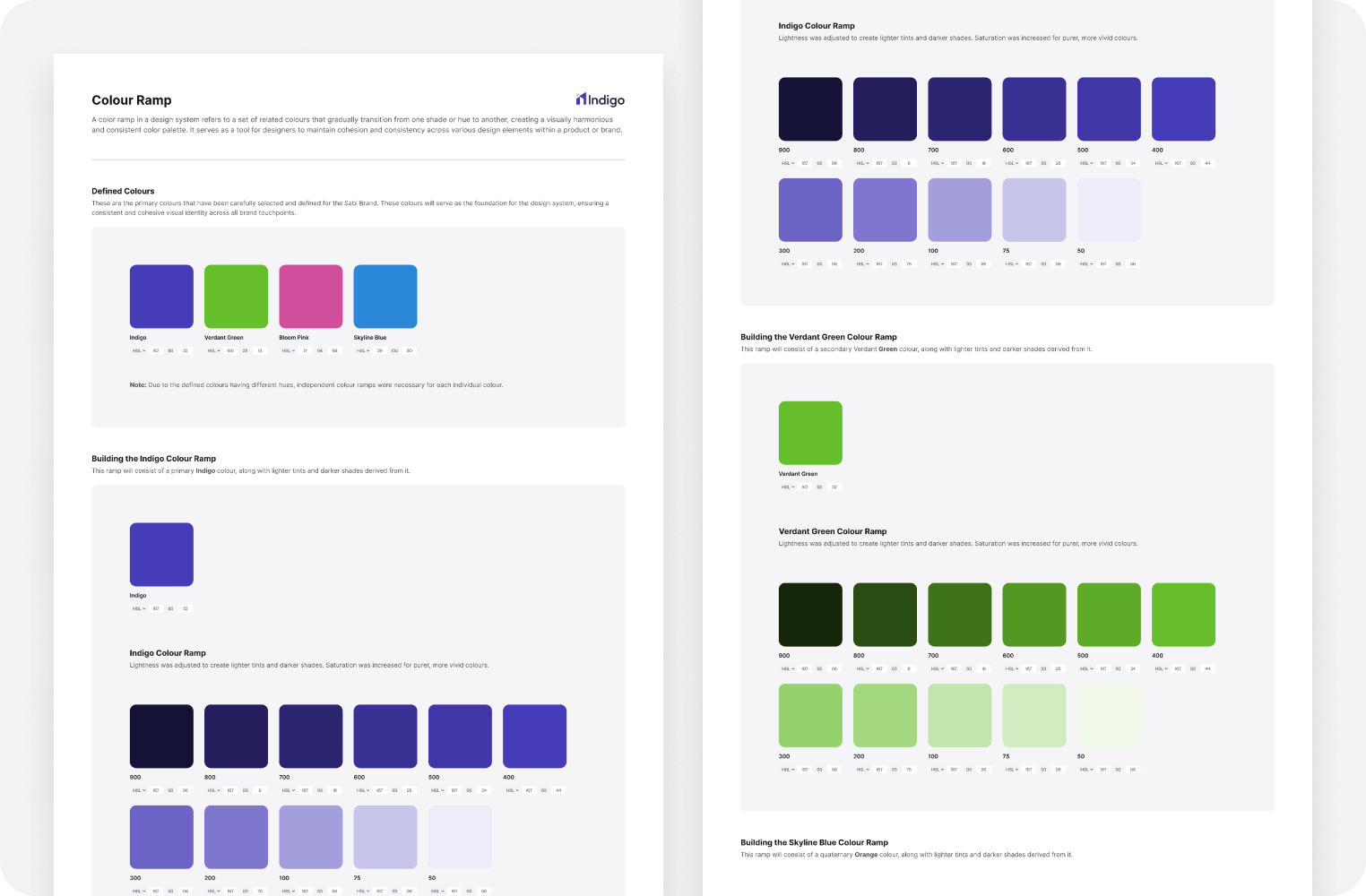
COLOR RAMP SNAPSHOT
Components
Action buttons, badges, status indicators
Text fields, forms for KYC, rent, and issue reporting
Tab systems and modals for multistep actions
TEXT FIELD COMPONENT SNAPSHOT
Looking back
Measuring success through velocity and clarity
Outcomes
As we move past MVP, the Indigo design system is evolving to support scale while keeping clarity and usability front and center.
Systemized components led to faster development across features
Stakeholder dashboards improved visibility and reduced support tickets
Pilot testers rated the UX “clear, fast, and professional”
What’s next?
As we move past MVP, the Indigo design system is evolving to support scale while keeping clarity and usability front and center.
Smart financial insights for landlords
AI-driven rent and occupancy forecasts
Multi-channel messaging components for tenant engagement
Up Next: Jojolo Mobile App